


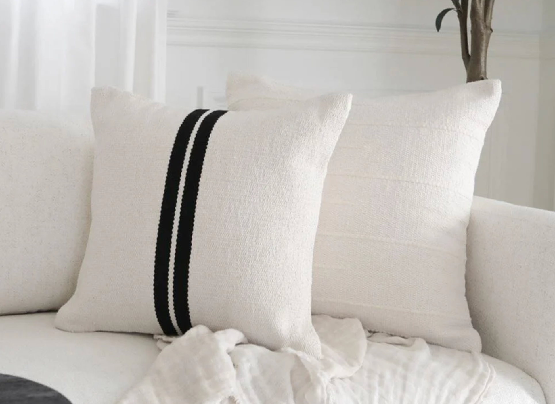
Pillow pairing is not the same as pillow matching. A pairing works when it holds difference and relation at the same time — enough contrast to register, enough connection to read as decided rather than accidental. That's the mechanism behind a good pillow pairing, and it holds whether you're working with two covers on an armchair or six across a sectional. Most people arrive at a pairing by instinct, buying pieces they individually like and hoping the combination sorts itself out once they're on the sofa. Sometimes it does. More often, the room ends up with pillows that are all fine on their own and unresolved together, which is a different problem than picking the wrong colors.
The Job Each Piece Does in a Pillow Pairing
A pairing needs one piece to lead and one to support, even when the difference between them is subtle or non-existent. On a sofa, that might mean a solid ground color anchoring the front row, with a smaller square cover in the same design, or perhaps a heavier weave or a deeper shade set just behind it. The mistake most people make is choosing every piece at the same weight, so nothing in the arrangement has anywhere to rest the eye. Assign the roles before assigning the colors, and the rest of the decision gets considerably easier.

Color Carries More of the Decision Than Pattern
Pattern gets the attention, but color is what actually holds a pairing together. The same logic works with the Monterey and Houston design — each display a color from a matching tone whether in full or in detail, in this case, natural cream, enough that neither one disappears into the other. A pairing built on undertone or one coordinating tone tends to age better too; matched sets read as a kit, while a considered undertone relationship still looks intentional a year later when the rest of the room has shifted around it.

Where Pattern Actually Earns Its Place
Pattern should sit on top of a color relationship that already works on its own — not stand in for one. A patterned cover paired with a solid in the wrong undertone will fight the solid no matter how well the pattern itself is designed. The safer approach: let one piece in the pairing carry the pattern and pull its dominant color from the solid it's paired with. An Astor with rust hand woven through it pairs cleanly with a cream printed design holding the same horizontal lines but in a different style, the eye reads the connection before it registers the print at all. Two patterned pieces in the same pairing rarely works unless the scale of each pattern is markedly different — one fine, one bold — and even then, it's worth testing before committing to a full set.
Scale and Texture Do the Rest of the Work
Once color is settled, scale is the next lever. A lumbar and a square read as a pairing partly because they occupy different shapes on the same surface, so the eye isn't reconciling two competing squares stacked side by side. Texture works the same way: a Bilboa cover next to a design woven Ivy in charcoal, creates depth without a second pattern doing the work. This is where Coterie Canvas is useful if you're testing a few combinations before committing — it lets you lay out scale relationships on a sofa or bed without buying two sets of covers just to compare them side by side in the room.
 Starting a Pillow Pairing Without a Full Set in Mind
Most pairing decisions go sideways because someone tries to solve the whole arrangement at once. Pick one anchor piece — a cover in a color you already know works in the room — and build outward from it one relationship at a time: color first, then scale, then pattern if you want it at all. The Curated Pillow Pairings is built around this same logic, with covers pre-matched on undertone and weight so the color decision is effectively already made. It's a reasonable place to start if you'd rather see a finished relationship before choosing the individual pieces yourself, and it's where most of our returning customers end up building from once they've found one pairing that works in their space.

Share:
How to Layer Pillows on a Bed Like a Designer
The Decorative Throw Blanket Isn't Designed to Keep You Warm