

Color gets the attention, but fabric decides how a pillow actually reads in a room. A linen cover and a velvet cover in the same shade of ochre will look like two different colors side by side because one absorbs light and the other bounces it. Once you start choosing pillow cover fabrics for how they behave rather than how they photograph, arranging them gets easier — and the results hold up better in person. Linen, velvet, and bouclé cover most of what a room needs from a pillow — a matte neutral, a light-catcher, and a texture — which is part of why they turn up together as often as they do.
Linen softens with use instead of wearing down
Flax is one of the few fibers that gets better the more you handle it. A new linen cover has a crispness that relaxes over the first few weeks, and the weave — irregular, faintly slubbed — catches light unevenly in a way that reads as texture rather than sheen. It wrinkles, which some people resist and others prefer; the creases are part of what makes linen look lived-in rather than staged. In color, it stays quiet. A cover in oat or flax holds its neutrality from across the room and only shows its character up close, where the grain of the weave becomes visible. That restraint is why linen works as the base layer in almost any arrangement — it gives the louder fabrics something to sit against.

Velvet does its work with light
Run a hand across velvet and the color changes — that shift is the pile catching light from a new direction. A velvet cover reads darker one way and brighter the other, which is why a single velvet pillow can look like it's doing more than a matte one in the same color. The fabric carries visual weight; it pulls the eye and sets a tone. It also keeps a record of use. Velvet shows where it's been leaned against, and the crushed areas develop a patina that some people read as wear and others read as depth. Cotton velvet handles daily contact better than most people expect, though a velvet pillow will always look more considered on a bed or a reading chair than in the middle of a sofa that takes constant traffic.

Bouclé is a texture you can read across the room
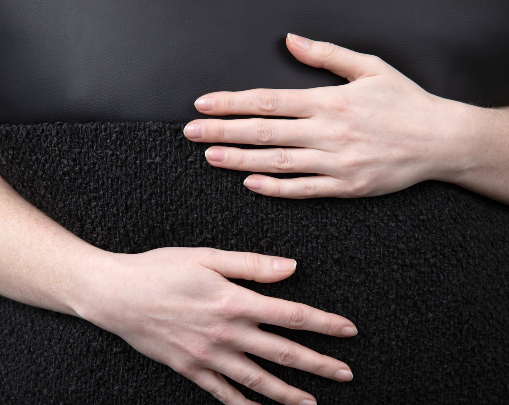
The looped yarn that gives bouclé its name creates a surface with real dimension — small curls and knots that break up light and cast their own faint shadows. It's the most tactile of the three, and the most sculptural. A bouclé cover in cream or ivory adds interest to an arrangement without adding color, which makes it useful when a palette is already doing enough and the room needs contrast of a different kind. The texture reads contemporary, an association it earned from mid-century furniture, and it pairs as easily with a new sofa as with an older one. Most bouclé is wool or a wool blend, which gives it body and a little warmth to the hand; a cotton bouclé reads lighter and cooler, closer to linen in feel if not in look. The one caution is construction: a loosely looped bouclé can snag, so it belongs where it won't catch on buckles or claws. On a bed or a bench, it holds up and holds its shape.

Start with the fabric, get the insert right, and the color tends to take care of itself.
Share:
Mixing Throw Pillow Sizes on a Sofa - The Ultimate Guide
How to Layer Pillows on a Bed Like a Designer