
Neutral throw pillows get treated as the safe choice — the thing you reach for when you'd rather not commit to a color. Done without attention, a neutral sofa reads flat. Done with intention, it reads considered.
The difference rarely comes down to buying more pillows. It comes down to which neutrals you set next to each other, and why.
Neutral Isn't One Color
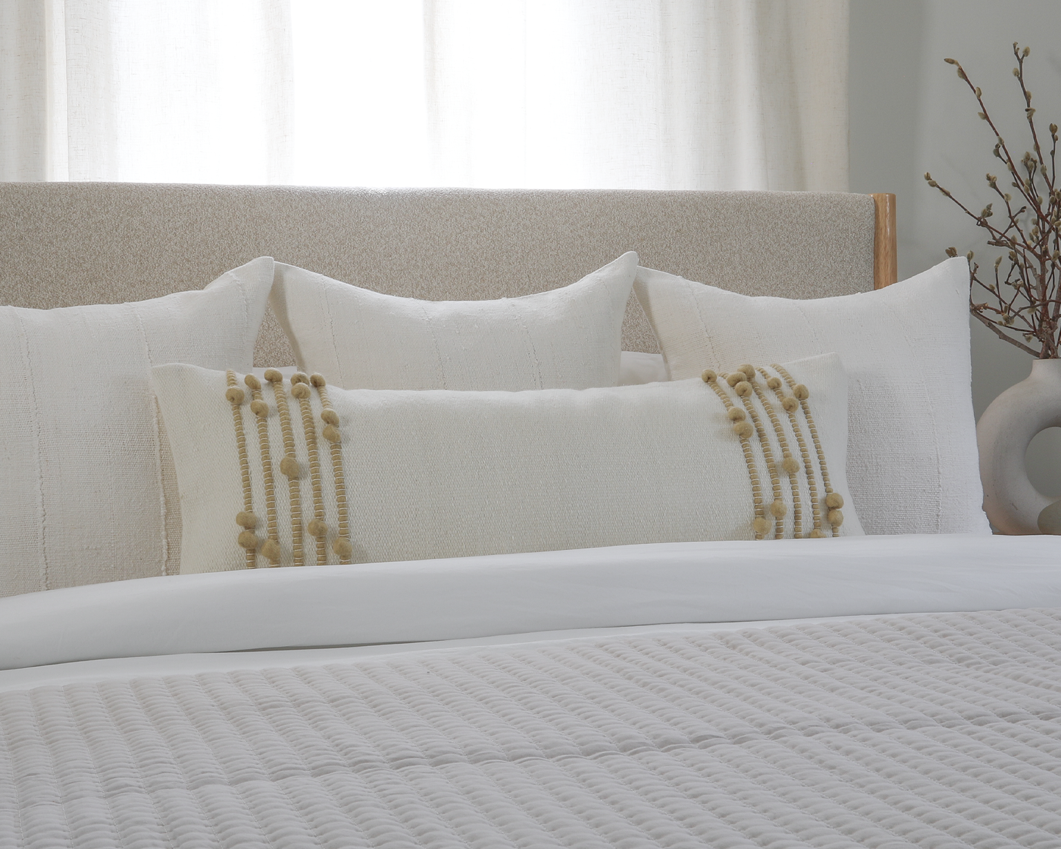
Oat and bark are both neutrals, and up close, they have almost nothing in common. Between them sit flax, ecru, and wheat — a spectrum with real distance, and that distance is what you work with. Set oat beside ecru and the two nearly dissolve into one another; the eye reads softness and quiet, a single continuous surface. Set bark beside natural and you get contrast that still stays inside the family — depth without a visual jolt.
Texture carries what color won't. A flat-woven cover and a heavy slubbed linen can share an exact shade and still read as two different things, because light catches them differently as it crosses the room through the day. It's the reason a photograph so often undersells a good neutral — the weave that makes it beautiful may flatten in an image. You learn to buy these by touch as much as by shade.

The Combinations That Hold Together
Most neutral palettes fall apart for one of two reasons: everything sits at the same value, so the whole thing goes muddy, or warm and cool tones quietly fight each other across the arrangement. The fix for both is the same.
Warm neutrals read earthy and a little sunlit: wheat, oat, flax, bark, ochre. Cool ones read crisp: natural, ecru, onyx, the grayer end of the range. Crossing the line isn't forbidden, but the most reliable neutral pillow combinations stay mostly warm or mostly cool and let a single piece do the crossing.
Neutral Color Palette
Timeless, Versatile & Effortless
Warm Neutrals
Cool Neutrals
Coterie Brooklyn · Est. 2016
Three combinations that hold up:
1. Three light tones close enough in value to read as one soft field, where texture does all the talking.

2. Wheat and bark with a single note of ochre give you warmth with a floor under it; the deep tone keeps the lighter ones from floating off.

3. Introduce Sage — technically a color, it behaves like a neutral and bridges warm and cool without picking a side, which is why it sits as comfortably with oat as it does with cream. When a palette feels stuck, it's often the piece that redeems it.

The Sofa Decides the Palette
Combinations don't happen in a vacuum — they happen on a specific sofa. The couch color sets the starting point.
Beige Couch
A beige sofa already sits in the middle of the neutral range, so matching it leaves you with mush. Pull away from it instead — lighter with ivory and cream, or grounded with the Imogene and a note of linen ochre — so the pillows separate from the cushion rather than melting in.

Gray Couch
A gray sofa reads cool, and cool tips cold fast. Warm it with wheat, oat, and a measured amount of rust or deeper wheat tones.

White / Ivory Couch
White and ivory sofas are the most forgiving and the easiest to flatten, since everything on them is contrasted by default. Stay tonal with ecru and oat, and let one deeper piece anchor it — the Townsend Charcoal works well in a warm palette; the Ivy Charcoal rounds out the cooler end.

Leather
Leather already carries warmth and a low sheen, so answer with the opposite: matte and dry. Flax, natural, and bark linen against tan leather is hard to get wrong.

If weighing tone against tone sounds like more bookkeeping than you signed up for, the Curated Pillow Pairing selection does the matching in advance. The Pillow Arranger lets you mix and match designs on the backdrop of any sofa color.
Share:
How to Choose Pillow Inserts (And Why Size Matters)
An Oversized Lumbar Pillow Is the Secret to Styling a King Bed or Bench perfectly.